Tips and tricks : When to use stacked charts.
Stacked charts are popularly used for visual analysis. But when is it ideal to use them?
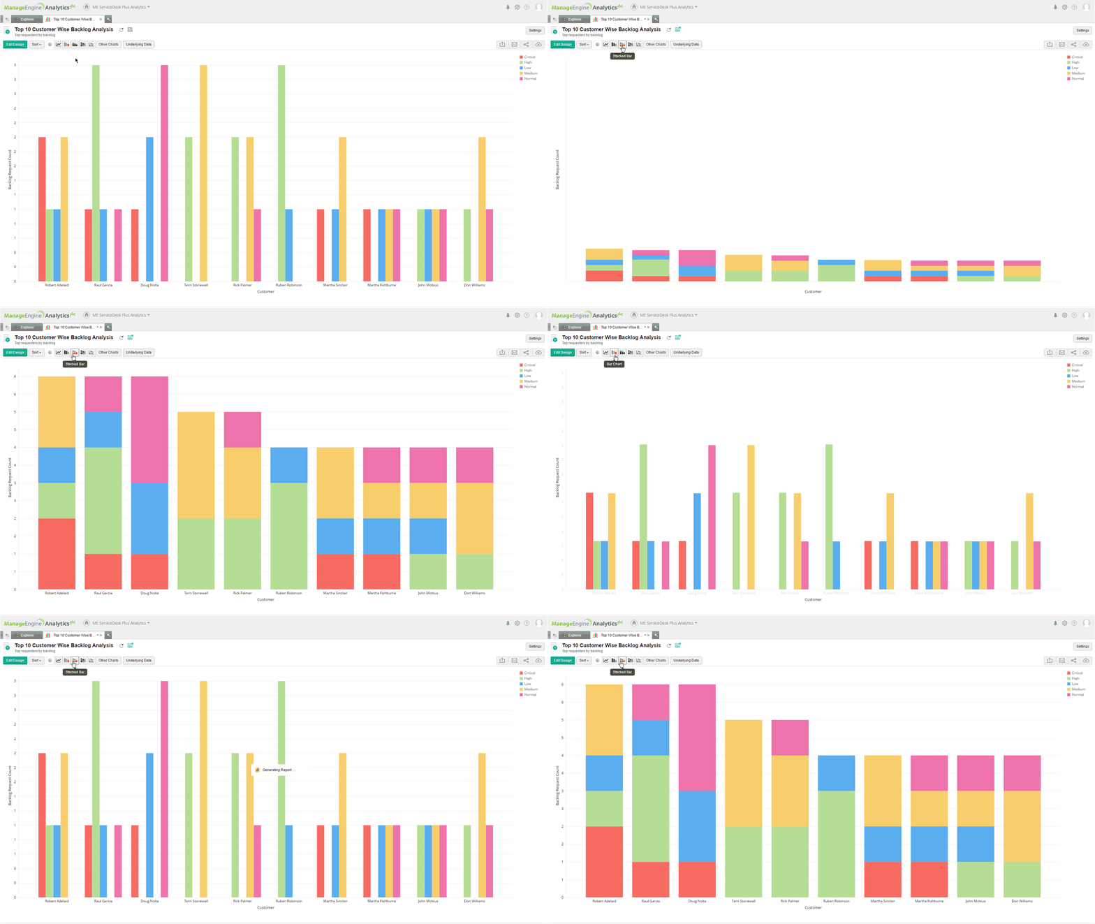
1. When you want to compare data values, use the stacked bar chart.
Stacked bars are better than bar charts when there is a field used in the color section of your chart builder. They are useful, when you want to analyze different parts of a whole.
Example shows a stacked bar chart displaying the backlog requests for 10 customers, based on priority.

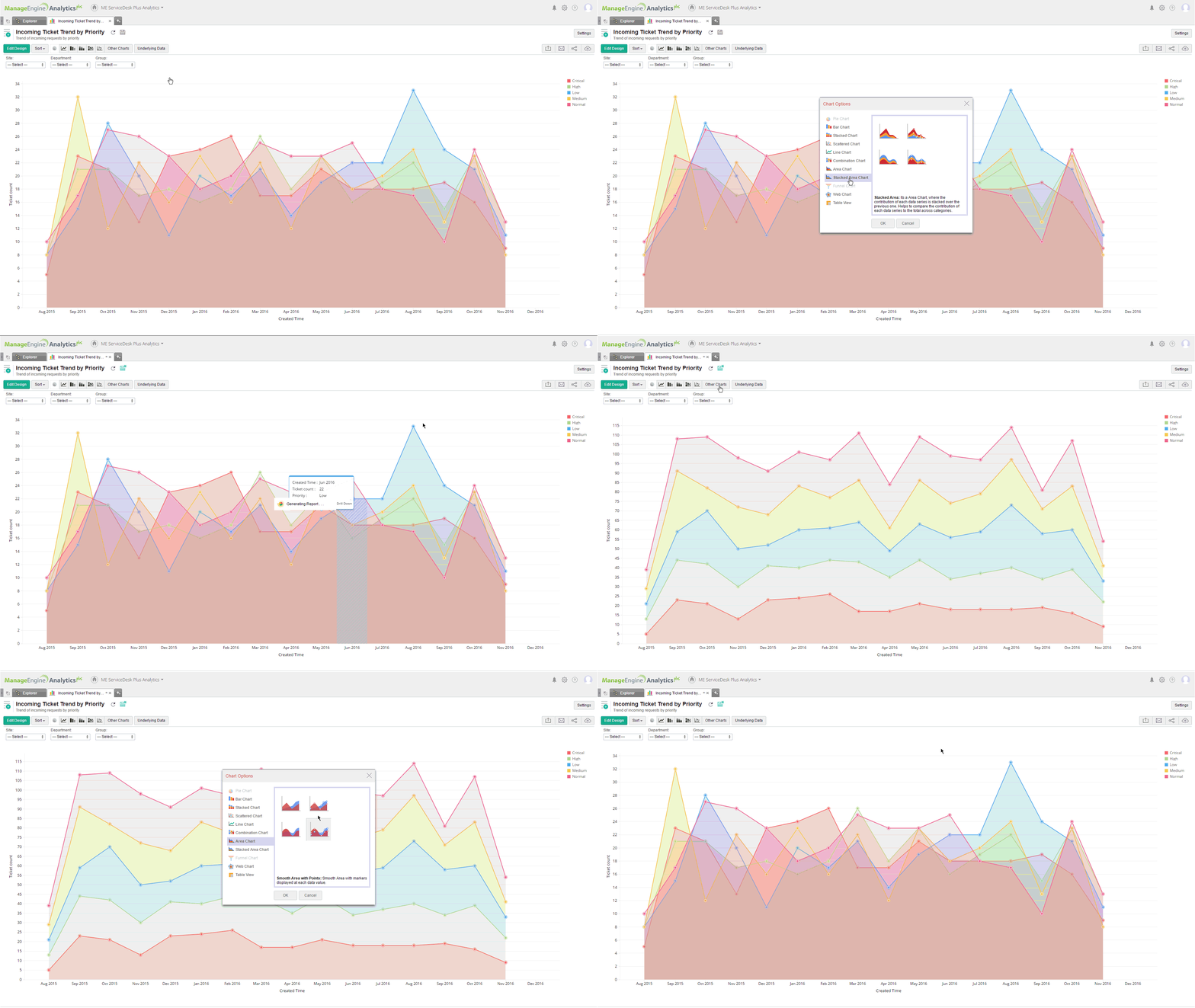
2. When you want to compare trends across different categories, use stacked area charts.
These charts accurately represent the change in volume over time.
Example shows a stacked area chart displaying the monthly ticket trend, based on priority.

Topic Participants
Pritika R
New to M365 Manager Plus?
New to M365 Manager Plus?
New to RecoveryManager Plus?
New to RecoveryManager Plus?
New to Exchange Reporter Plus?
New to Exchange Reporter Plus?
New to SharePoint Manager Plus?
New to SharePoint Manager Plus?
New to ADManager Plus?