Introducing the Enhanced Applications Manager Widgets & Dashboards
We’re excited to introduce a series of updates to the Applications Manager's widgets & dashboards, designed to provide a more intuitive, interactive, and visually engaging experience. These enhancements have been developed in response to valuable feedback from our users, with a focus on improving usability, functionality, and data visualization.
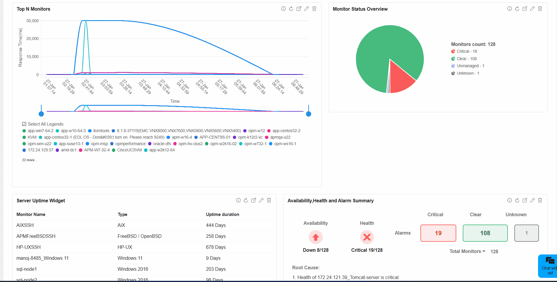
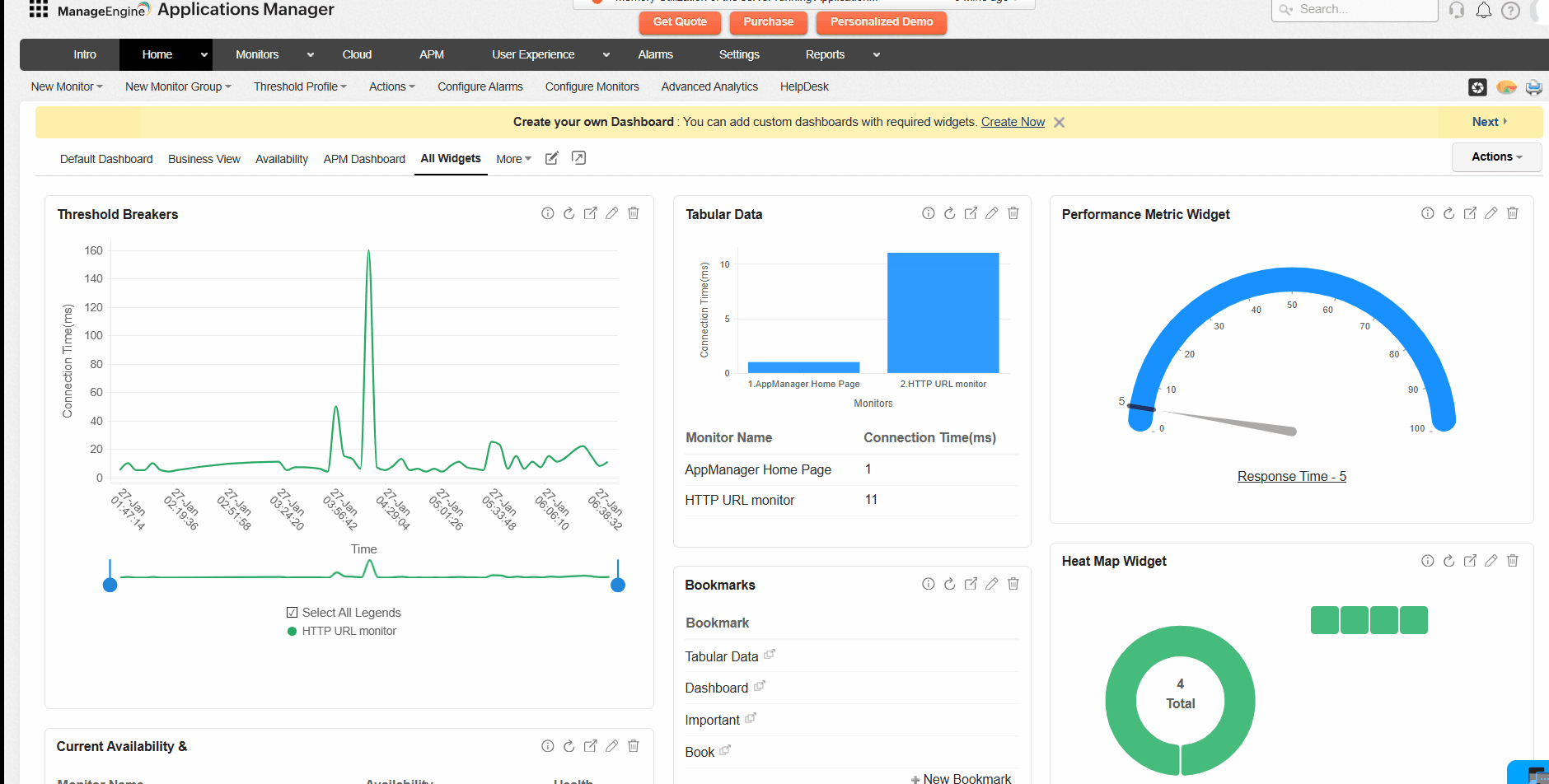
1. Migration to Zoho Charts
One of the most significant updates is the transition to Zoho Charts, aimed at offering a more interactive and dynamic approach to data visualization.
With Zoho Charts, you can now:
Access instant insights with tooltips
Hover over data points to instantly view detailed information without needing to dig deeper manually. This makes it easier to interpret data quickly and accurately.Explore data with zooming and panning
Focus on specific sections of your data by zooming in and out effortlessly. Navigate through large datasets using panning, enabling for a smoother analysis experience.Experience enhanced visual flow with animations
Enjoy smoother transitions and animations that make interacting with charts feel more natural and engaging.
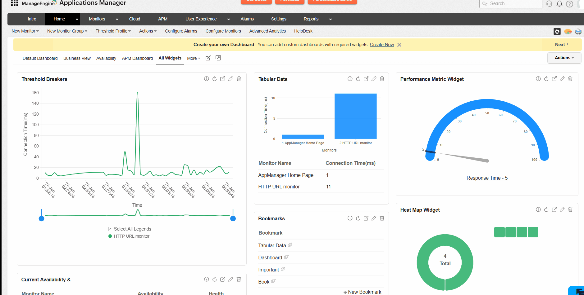
These features come together to make data analysis faster, more interactive, and visually engaging.
The update doesn’t stop with the migration to Zoho Charts! We've also introduced several key improvements to how charts function within the dashboard.
Zoom capability for detailed analysis
You can now zoom in on specific sections of your charts for a closer look at data trends and patterns. This makes it easier to identify anomalies or patterns over time.Scrollable legends for better navigation
You can now scroll through legends when working with multiple metrics, providing easier access to various data points. This improves navigation and ensures better visibility, even when using multiple monitors.Overview chart for quick summaries
The new overview chart gives you a summarized view of your data and allows you to set custom time frames. This helps in quickly identifying trends and focusing on areas that need attention.
➤ Line charts

➤ Bar and dial charts
- These chart types have been redesigned for improved clarity and a more engaging experience. The refined design makes it easier to interpret data and draw conclusions at a glance.
The dashboard interface has been refreshed to provide a cleaner, more intuitive experience that aligns with the design of the APM Insight dashboard.
Key improvements include:
Streamlined layout for improved usability
The updated layout simplifies navigation, making it easier to focus on the information that matters most.
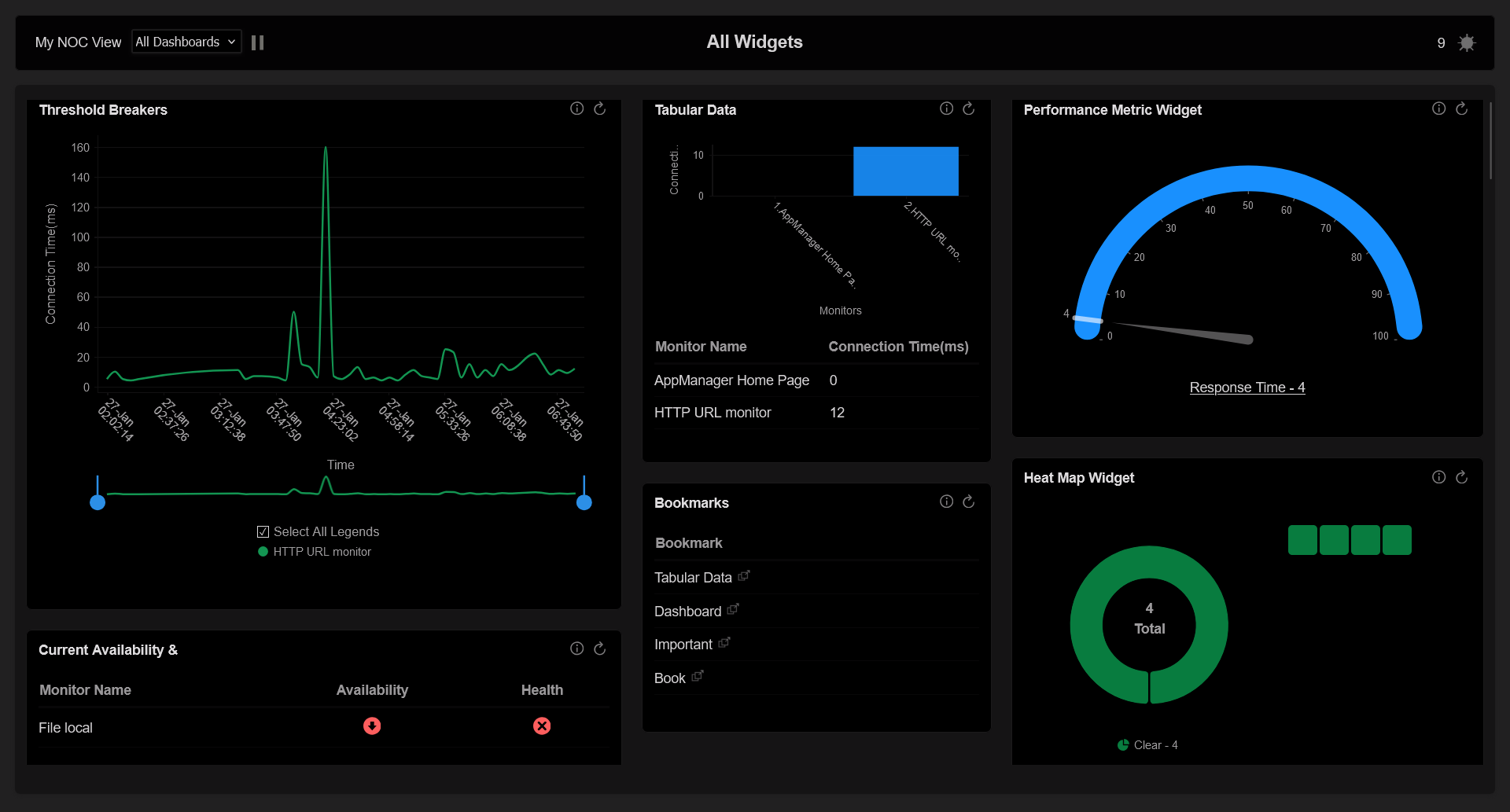
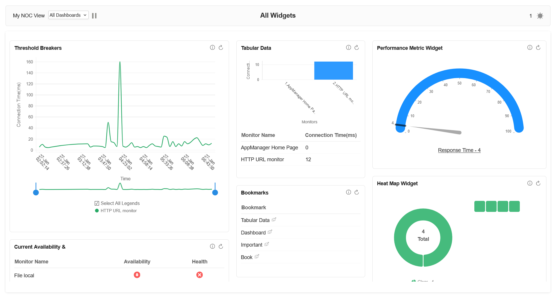
Adaptive dark and light modes
Whether you prefer a dark or light theme, the dashboard now seamlessly adapts to your environment. This is particularly useful in the Network Operation Centers (NOC) view, where lighting conditions can vary.
4. SVG severity status icons for clearer visuals
We've upgraded our severity status icons to SVG format, providing crisper and clearer visuals across the dashboard.
With these updated icons, you can:
Quickly distinguish between health and availability statuses
The improved clarity makes it easier to identify the status of various components at a glance, enabling faster responses to critical issues.Enhanced visibility in NOC view
The icons are optimized for both dark and light modes, ensuring better visibility regardless of your viewing preference.
This upgrade helps reduce confusion and speeds up issue identification, especially in high-pressure monitoring environments.
Helpful resources for navigating the updates
To help you get the most out of these enhancements, we’ve updated our help resources. These guides provide detailed instructions and best practices for using the new features.
If you're already using Applications Manager, you can access these improvements starting from version 174700. The updated dashboard is designed to simplify your monitoring processes and enhance data visualization, making it easier to gain actionable insights.
For new users, this is the perfect opportunity to experience what Applications Manager has to offer. Start with a free 30-day trial and see how these enhancements can streamline your monitoring experience.
We believe these updates will make a meaningful difference in how you interact with and interpret your data.