Improve Self-Service Portal Cancel Dialog UX
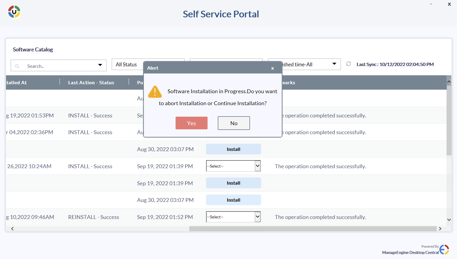
When closing the Self-Service portal window while software is still installing, the following dialog appears
The choices of "Yes" or "No" as answers to "Do you want to abort Installation or Continue Installation" makes the result of either choice extremely unclear and will be confusing for end users. The text is also sloppily formatted (e.g. lack of space between sentences, the inline image displacing text, inconsistent capitalization). Some layout and content editing will help make this clear for end users and
Topic Participants
Joshua Styger
Harish Kumaran
New to M365 Manager Plus?
New to M365 Manager Plus?
New to RecoveryManager Plus?
New to RecoveryManager Plus?
New to Exchange Reporter Plus?
New to Exchange Reporter Plus?
New to SharePoint Manager Plus?
New to SharePoint Manager Plus?
New to ADManager Plus?