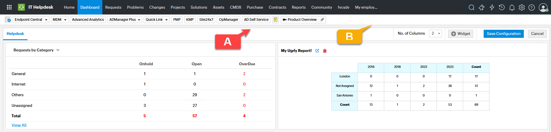
Default Report vs MY report!
A-The default report in the SDP dashboard is a beautiful matrix report.
B-But when we create a custom report of matrix type and add it to the dashboard, it is very ugly, it is not sortable, and it does not have an attractive view. So It can neither be clicked nor filtered in the dashboard.
Please work more on tabular and matrix reports, it has a very poor user interface.
You have shown that you are better, so be the best

Topic Participants
Larria
Dinesh Bhaskaran
New to M365 Manager Plus?
New to M365 Manager Plus?
New to RecoveryManager Plus?
New to RecoveryManager Plus?
New to Exchange Reporter Plus?
New to Exchange Reporter Plus?
New to SharePoint Manager Plus?
New to SharePoint Manager Plus?
New to ADManager Plus?